Bar Graph Maker
Create a bar graph online with this free bar graph maker. Enter your data, choose a style, customize your labels and colors, and download your final chart as a PNG, JPG, or SVG. You can also import data from a CSV file. Share your graph or embed it on a website. No account creation is required. Works on phones, tablets, and computers.
Enter Your Data
Comma-separated values, one series per bar.
Create a Chart in 3 Simple Steps
Enter Your Data
Add your categories and values directly in the above bar graph creator. If your data is already in a spreadsheet, you can also import it with a CSV file instead of entering everything manually.
Choose and Customize Your Graph
Select the type you need, then customize your chart title, X-axis, Y-axis, labels, colors, legend, background, and grid lines. You can also display values directly on the bars.
Download or Share Your Graph
When your chart looks the way you want, download it as a PNG, JPG, or SVG file. You can also share it or embed it on a website.
Key Features of Bar Graph Maker
Create and customize a bar chart without using design software. Its main features are as follows:
- Free to use: Create graphs without a paid subscription.
- No account required: Start creating your chart without signing up.
- CSV import: Import your data from a CSV file.
- Multiple graph types: Create standard, stacked, segmented, double, triple, quadruple, multiple, horizontal, percentage, and error-bar graphs according to your needs.
- Custom chart titles: Add a clear title to your chart.
- Axis labels: Add labels to the X-axis and Y-axis.
- Value labels: Show the exact value on each bar.
- Custom colors: Change the colors used in your chart.
- Legend controls: Adjust the position of the chart legend.
- Grid lines: Choose the grid style that makes your data easier to read.
- Image downloads: Export your created chart as PNG, JPG, or SVG.
- Website embedding: Add your chart to a webpage with the available embed code.
What Is a Bar Graph?
A bar graph is also called a bar chart. It uses rectangular bars to compare values across different categories. Each bar represents a category, and its height or length shows its value. This is one reason bar graphs are useful: instead of comparing numbers row by row, you can compare categories visually.
Example: Coffee Shop Sales
For example, a coffee shop tracks the number of cups sold at four locations during one month:
| Store | Cups Sold |
|---|---|
| Store A | 420 |
| Store B | 610 |
| Store C | 340 |
| Store D | 705 |
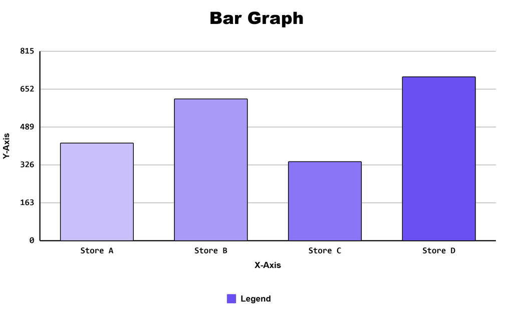
This graph shows that Store D had the highest monthly coffee sales with 705 cups, while Store C had the lowest with 340 cups. Store B sold 610 cups and Store A sold 420 cups. So, it become easy to compare sales across all four locations.
Who Can Use This Tool
Students
Create easy graphs for math homework, science projects, classroom surveys, presentations, and data-analysis assignments.
Teachers
Create simple examples, lesson visuals, worksheets, and classroom activities that help students learn how to read and interpret data.
Researchers
Present simple comparisons in reports, presentations, research papers, and other academic documents.
Small Businesses
Turn simple datasets into charts for reports, presentations, sales comparisons, and internal analysis.
Bloggers and Website Owners
Quickly create a chart, download it as an image, or embed it on a webpage.
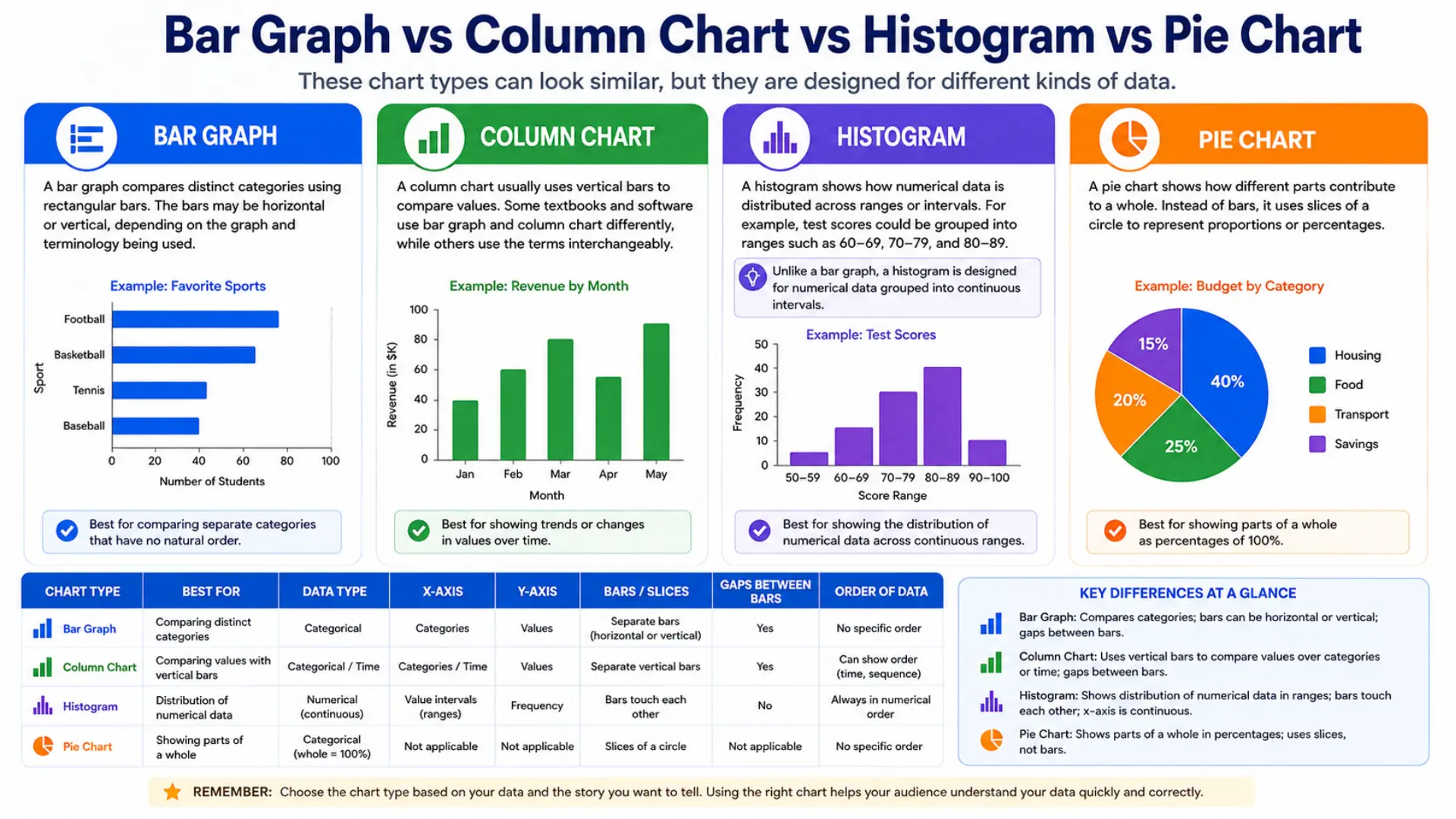
Bar Graph vs Column Chart vs Histogram vs Pie Chart
These chart types can look similar, but they are designed for different kinds of data.
Bar Graph
Compares distinct categories using rectangular bars. The bars may be horizontal or vertical, depending on the graph and terminology being used.
Column Chart
Usually uses vertical bars to compare values. Some textbooks and software use bar graph and column chart differently, while others use the terms interchangeably.
Histogram
Shows how numerical data is distributed across ranges or intervals. For example, test scores could be grouped into ranges such as 60–69, 70–79, and 80–89. Unlike a bar graph, a histogram groups numerical data into intervals, so the bars can touch each other.
Pie Chart
Shows how different parts contribute to a whole. Instead of bars, it uses slices of a circle to represent proportions or percentages.
Bar Graph Types and When to Use Them
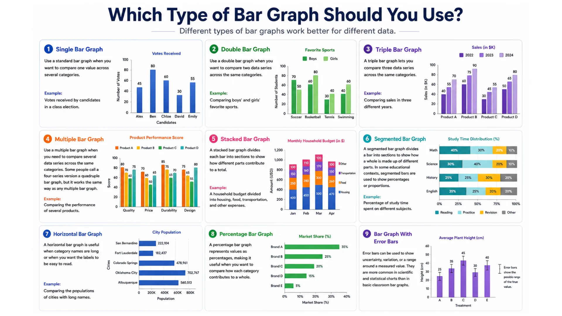
Different types work better for different data.
Single
A standard vertical bar graph compares one value across several categories. It’s useful when you want a simple, clear comparison.
Example: Votes received by candidates in a class election.
Double
Use this when you want to compare two data series across the same categories.
Example: Comparing boys’ and girls’ favorite sports.
Triple
Lets you compare three data series across the same categories.
Example: You can compare sales in three different years.
Multiple
Use this when you need to compare several data series across the same categories. Some people call a four-series version a quadruple bar graph, but it works the same way as any multiple bar graph.
Example: Comparing the performance of several products.
Stacked
Divides each bar into sections to show how different parts contribute to a total. Also called a segmented bar graph in some contexts.
Example: A household budget divided into housing, food, transportation, and other expenses.
Segmented
The same chart as a stacked bar graph. If you specifically need every bar scaled to 100% to compare proportions, use a percentage bar graph instead.
Horizontal
Useful when category names are long or when you want the labels to be easy to read.
Example: Compare the populations of cities with long names.
Percentage
Used to show values as percentages. Each bar represents 100%, making it easy to compare the percentage share of different categories.
With Error Bars
Used to show uncertainty, variation, or a range around a measured value.
How to Read a Bar Graph
Creating a chart is only one part of understanding data. You also need to understand what the chart is showing. To read a bar graph, first check the title and axis labels. Then compare the height or length of the bars to find the values and identify differences between categories.
- On a standard chart, the tallest or longest bar represents the highest value.
- On a standard chart, the shortest bar represents the lowest value.
- Bars of similar height represent similar values.
- The difference between two bars shows how much their values differ.
If the graph has multiple data series, use the legend to identify what each bar or color represents.
Where You Can Use Bar Charts
A bar graph maker isn’t limited to one kind of data; you can apply the same idea anywhere you’re comparing values across categories, such as:
- Students’ test scores
- Class survey results
- Monthly sales
- Product quantities
- Sports statistics
- Website traffic
- Expenses by category
- Books read by students
- Votes in a class election
The important part is that the categories are distinct and the values can be compared.
Bar Graphs for Elementary Students
Students start working with data and simple charts in elementary school. They learn to organize information into categories, compare values, and answer questions using visual data. As students move to higher grades, they work with larger data sets and learn to use scales. They also practice answering questions about differences, totals, and comparisons.
Simple charts can help students build basic data skills before moving on to more advanced topics such as statistics and data analysis. The basic skill is simple: organize the data, show it in a bar graph, and compare the values.
Tips for a Clearer Chart
A good chart should make the data easy to understand at a glance.
- Start the value axis at zero. Cutting it off exaggerates differences.
- Give it a clear title and label your axes.
- Stick to a few colors. Too many get confusing.
- Order bars by size, date, or category, whatever fits your data.
- Add value labels if exact numbers matter.
Avoid unnecessary 3D effects or decorations that make the data harder to read.
Final Thoughts
Whatever you’re comparing, this free bar graph maker can turn it into a clear chart. Enter your data manually or import a CSV, choose a type, standard, stacked, double, multiple series, percentage, or with error bars, and adjust the title, axis labels, and colors to match your data. No account is required, and any file you import stays on your device.
Once your chart is ready, download it as a PNG, JPG, or SVG, or use the embed code to add it to a webpage. For data that shows a distribution rather than a comparison, the histogram maker is the better fit.
Frequently Asked Questions
About This Bar Chart Maker Guide
This guide was written and reviewed by Muhammad Umer Shuaib, who builds and maintains bargraphmaker.co along with other educational web tools like a grade calculator. The examples and explanations on this page are created specifically for this guide. This page is reviewed and updated when important information or tool features change.